
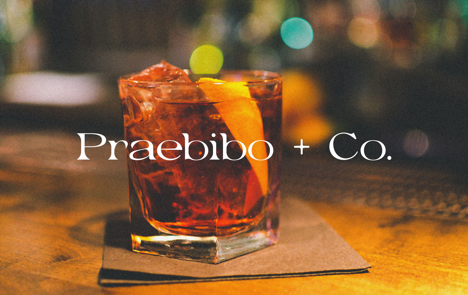
Praebibo + Co.
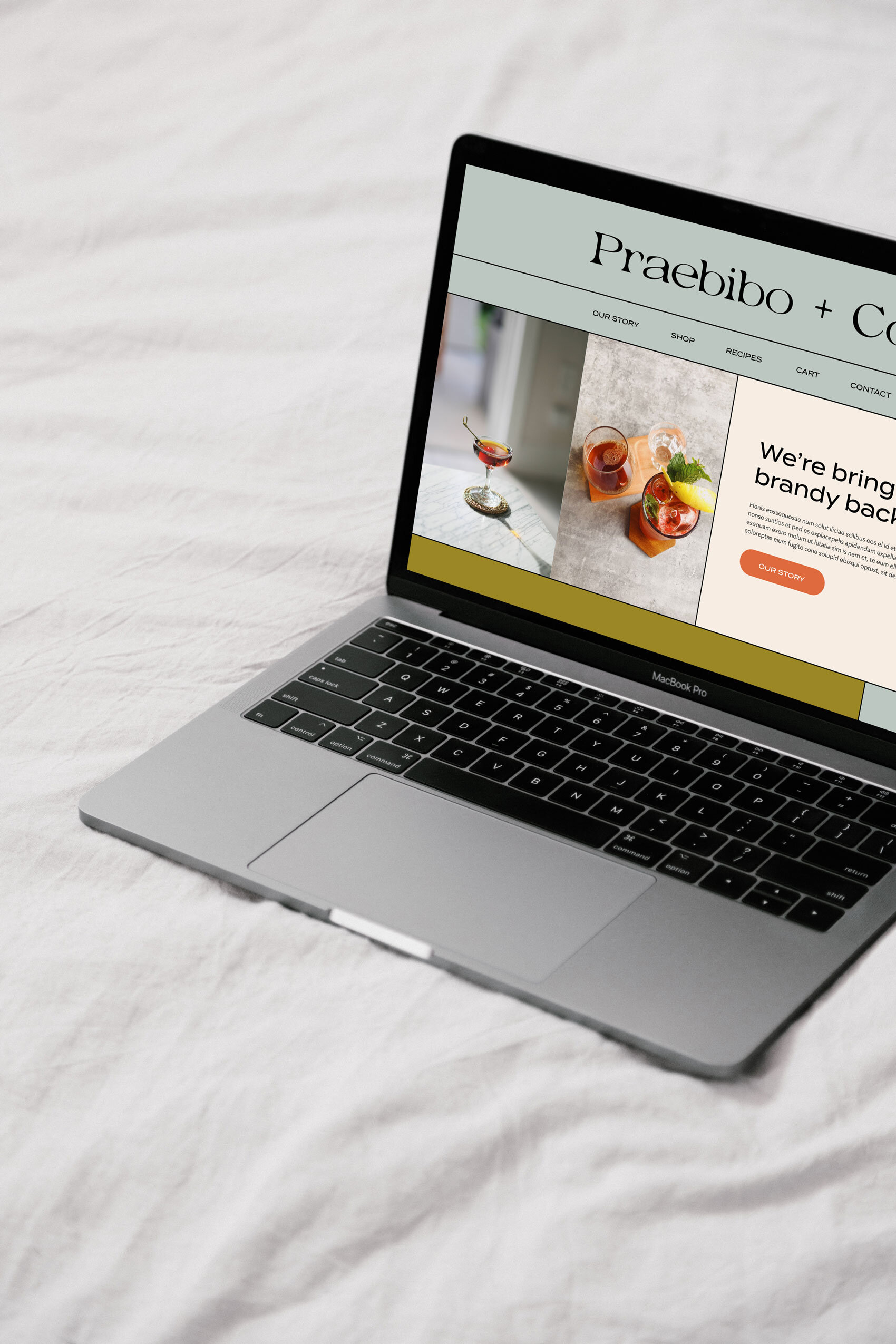
Branding + Web Design + Packaging
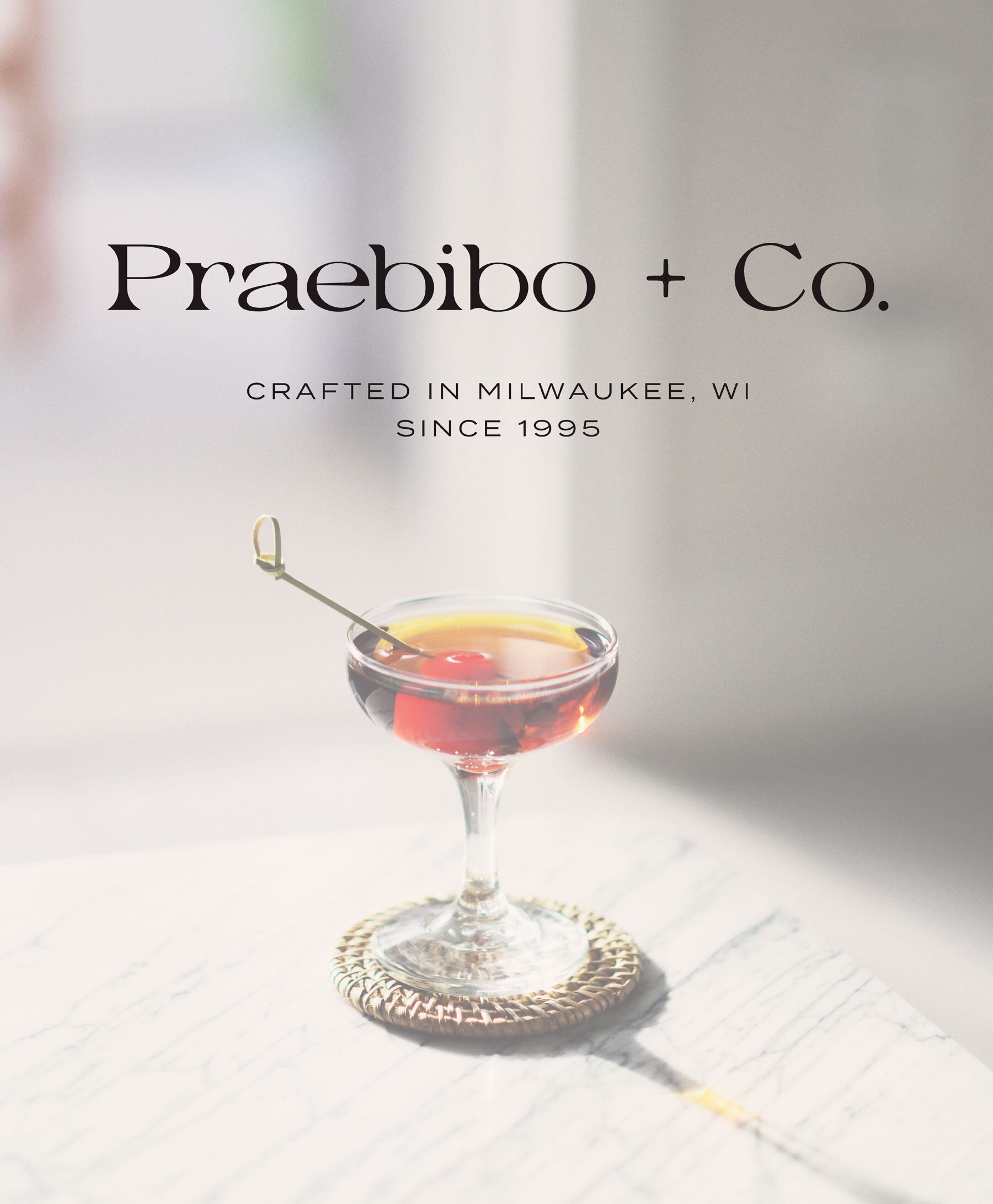
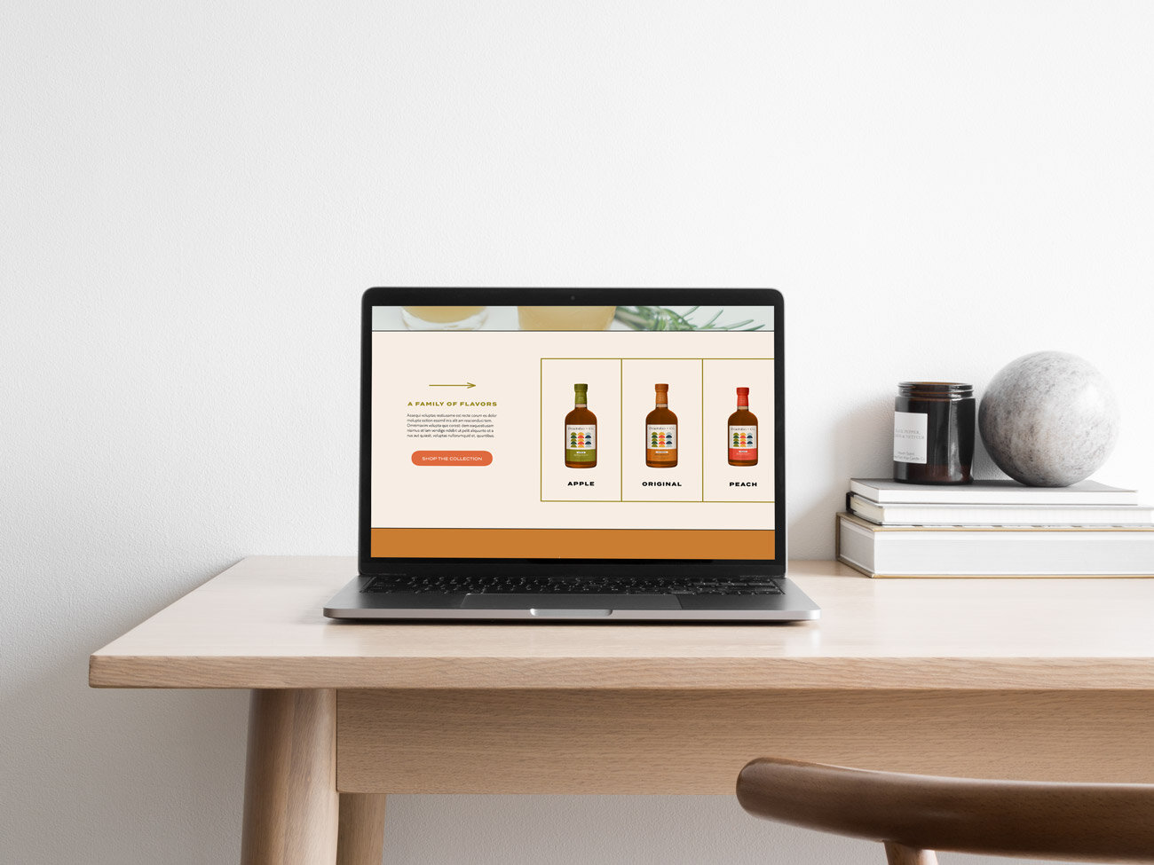
Praebibo + Co. is a concept modern brandy company based in the Midwest. I recently discovered the winter cocktail that is brandy and warm apple cider, so I was inspired to design brandy packaging that I would buy. I chose the name “Praebibo” because it means “to toast” in Latin (I think? You know how these things go).
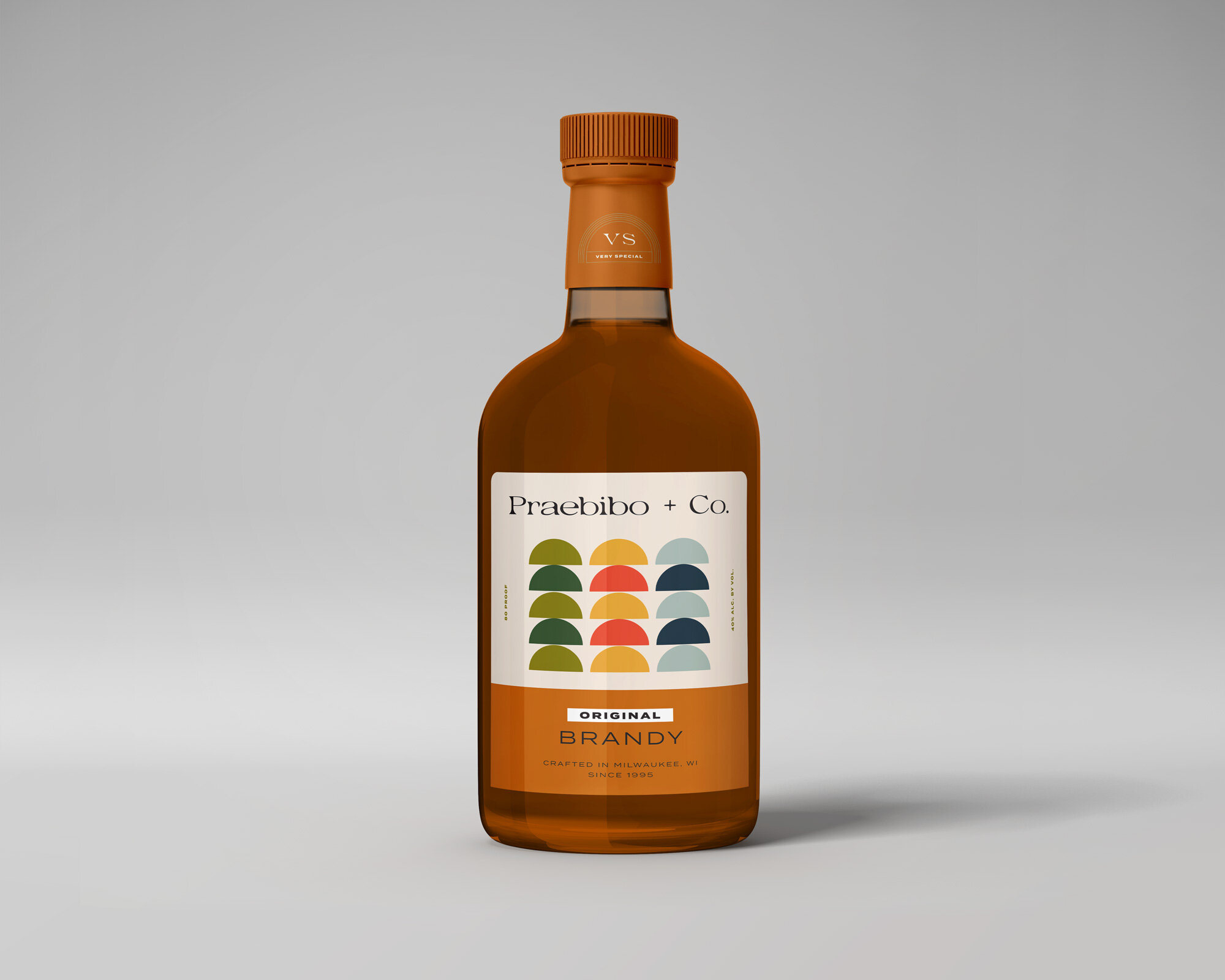
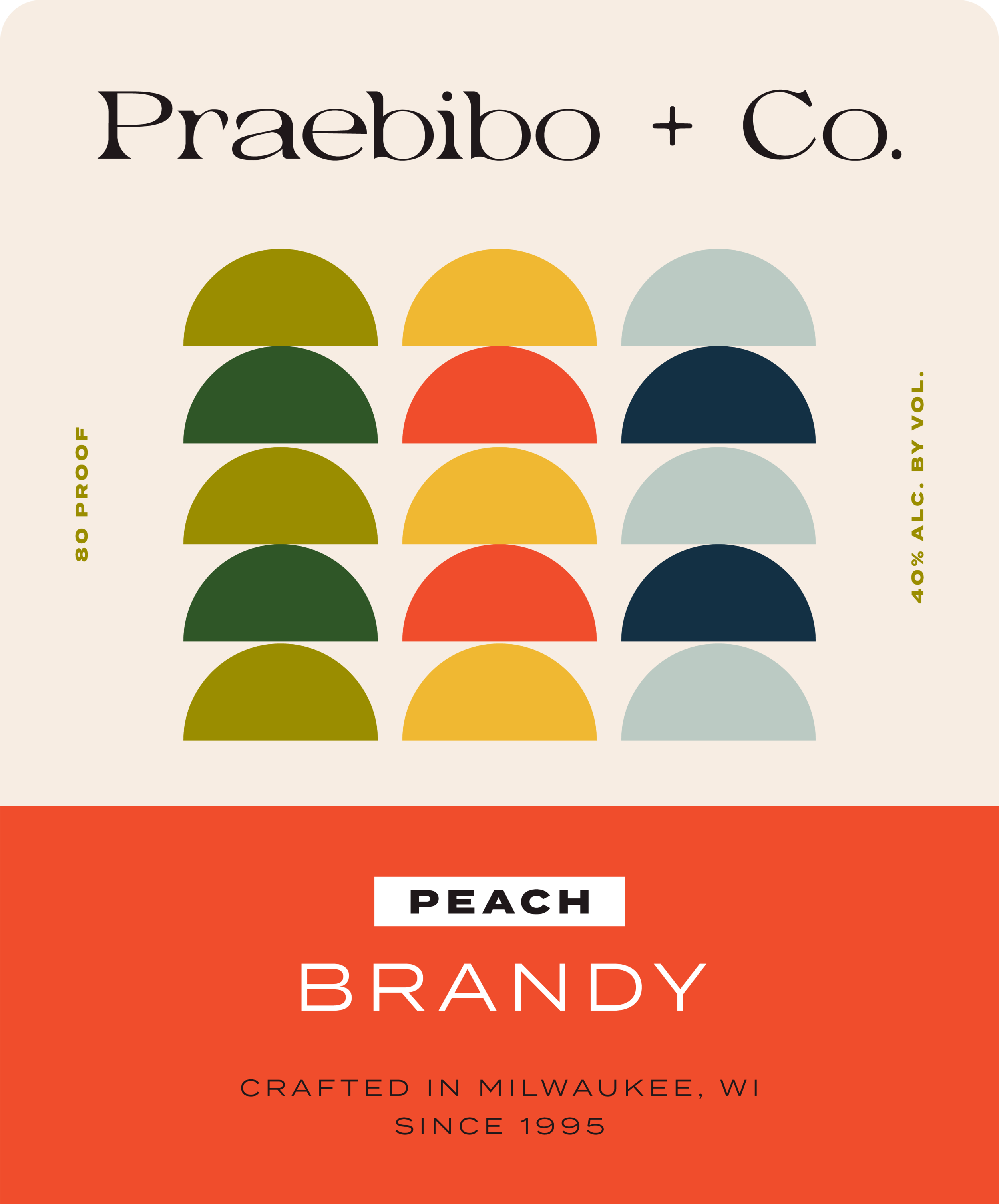
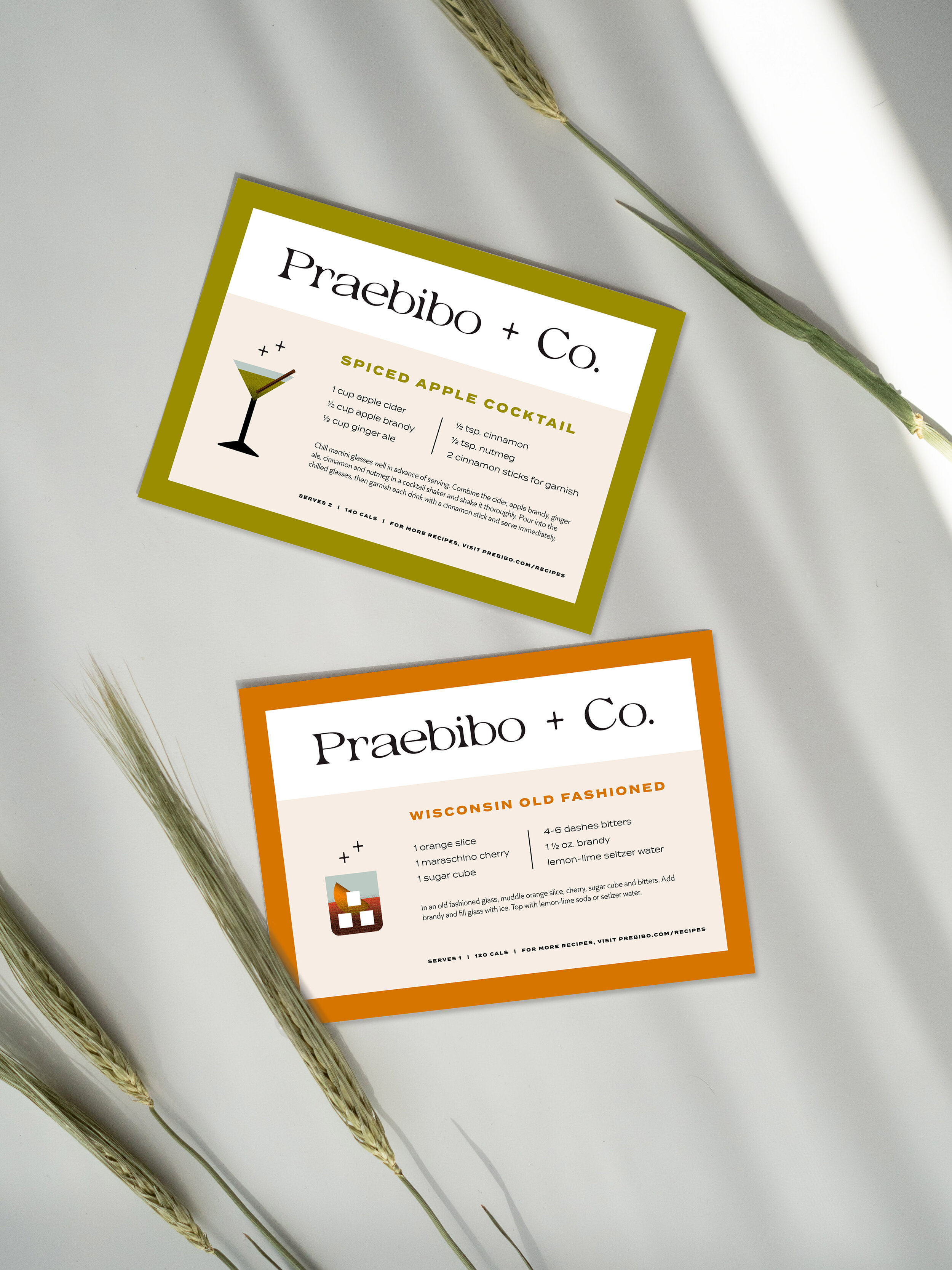
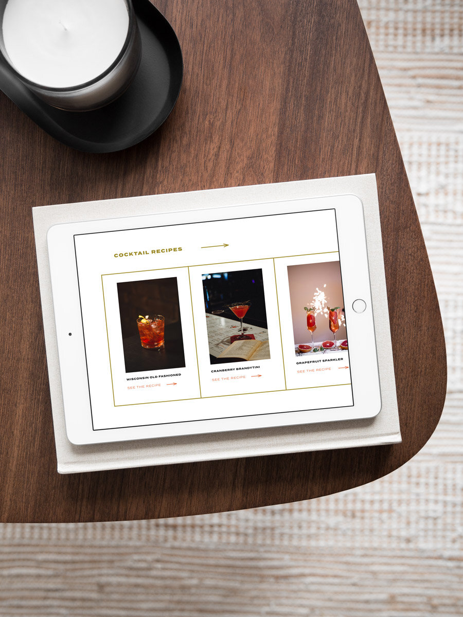
A lot of current brandy packaging is marketed towards older adults with a masculine look and feel. They show luxury branding with dark colors, script typography, and historic design elements. My goal was to reposition brandy as a modern cocktail mixer and attract in a new, younger-adult audience. I wanted to keep the luxury feel of other brands but make this stand out on the shelves.
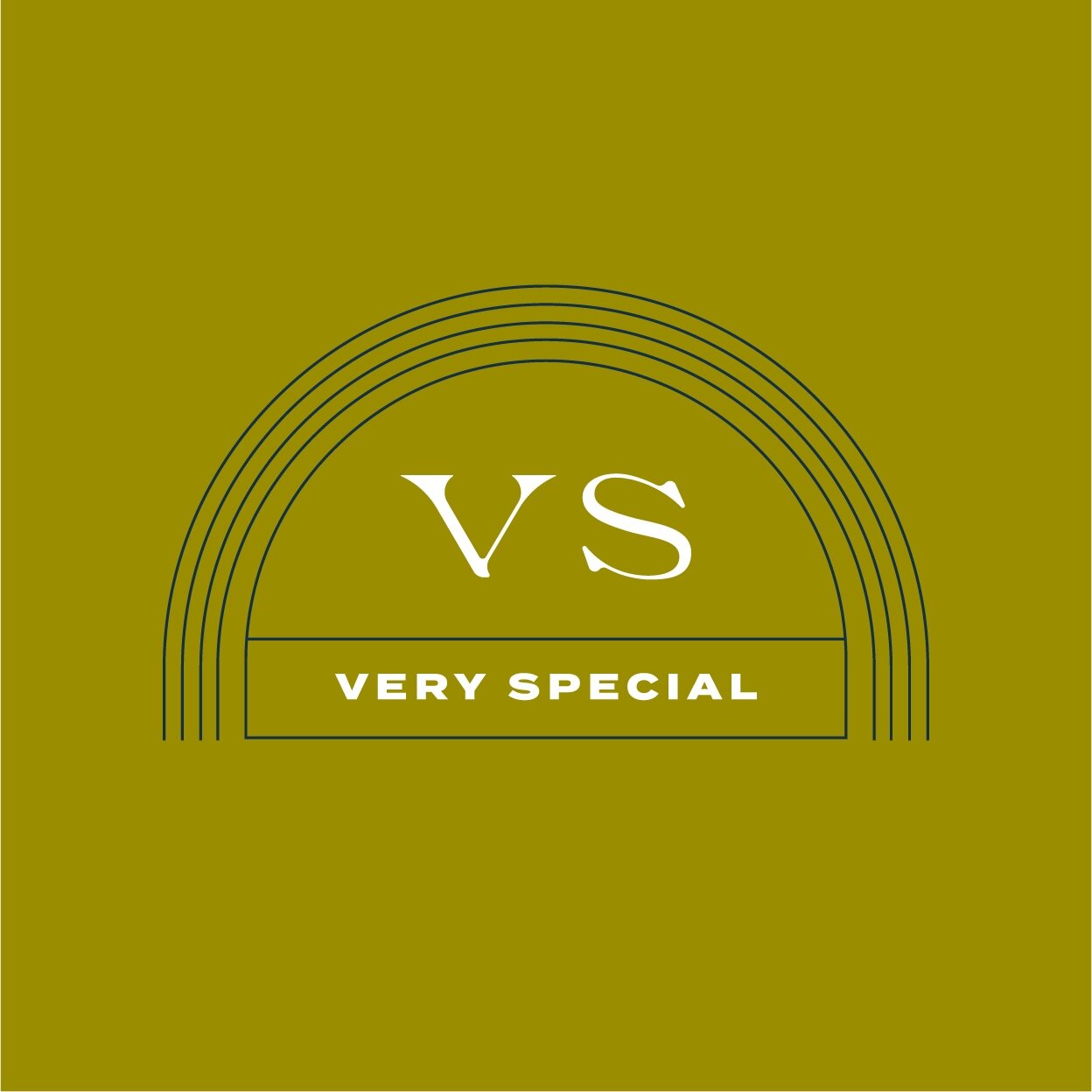
I used colorful patterns and illustrations to separate this brand from any others. The brand typography is wide, which gives it a luxury feel, but the rounded and pointed edges make it contemporary.

BACK TO PROJECTS →